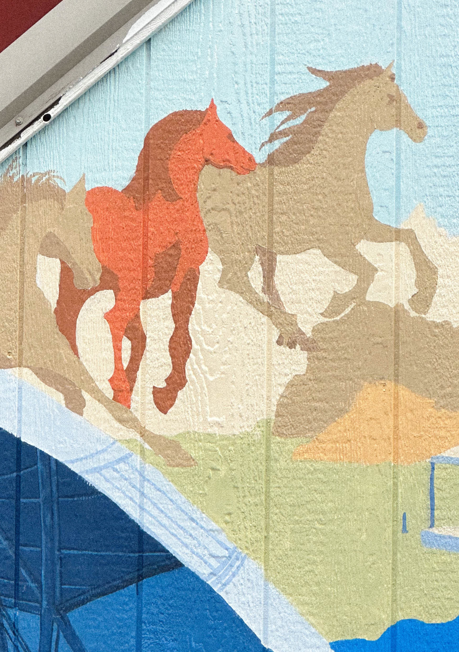
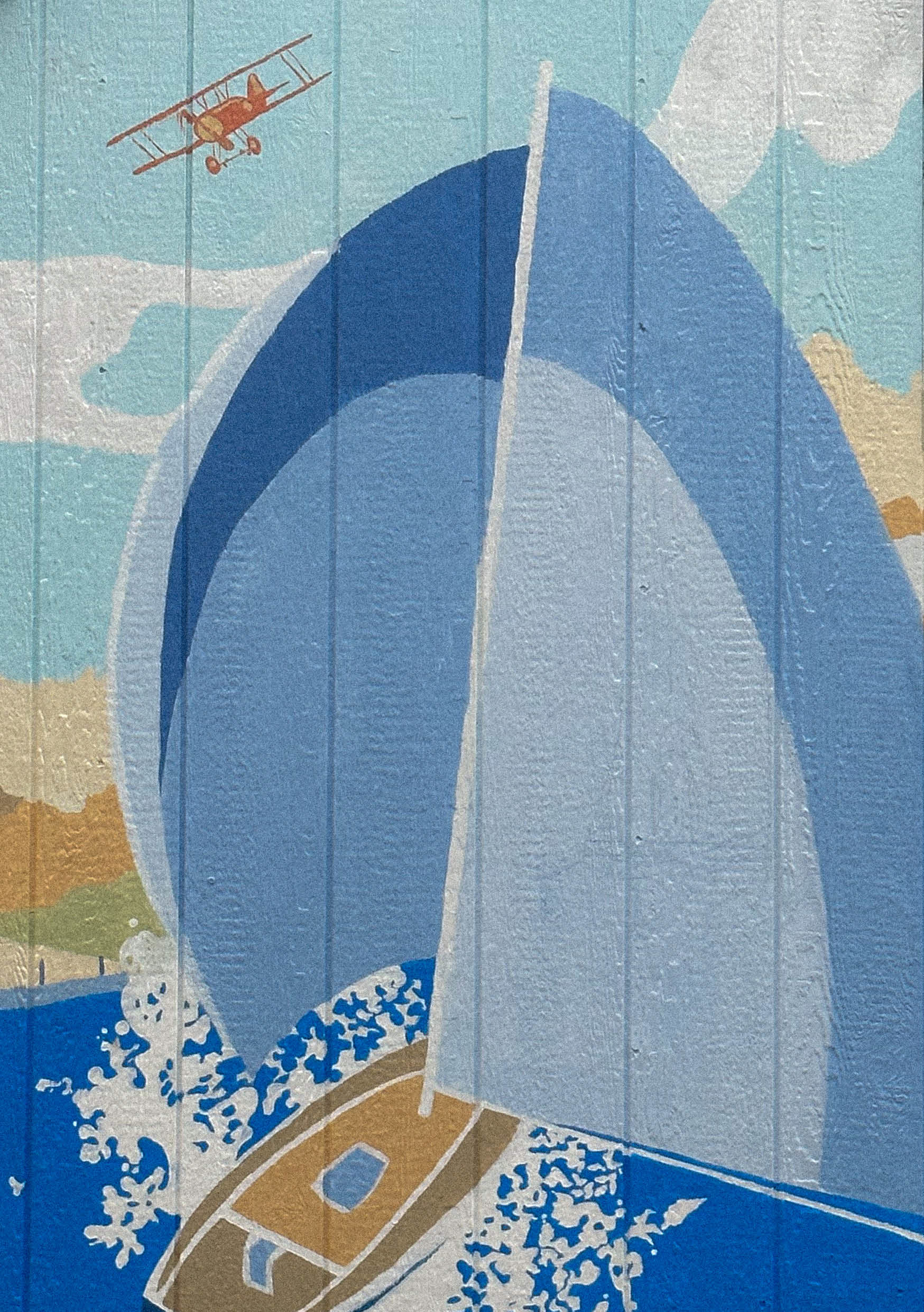
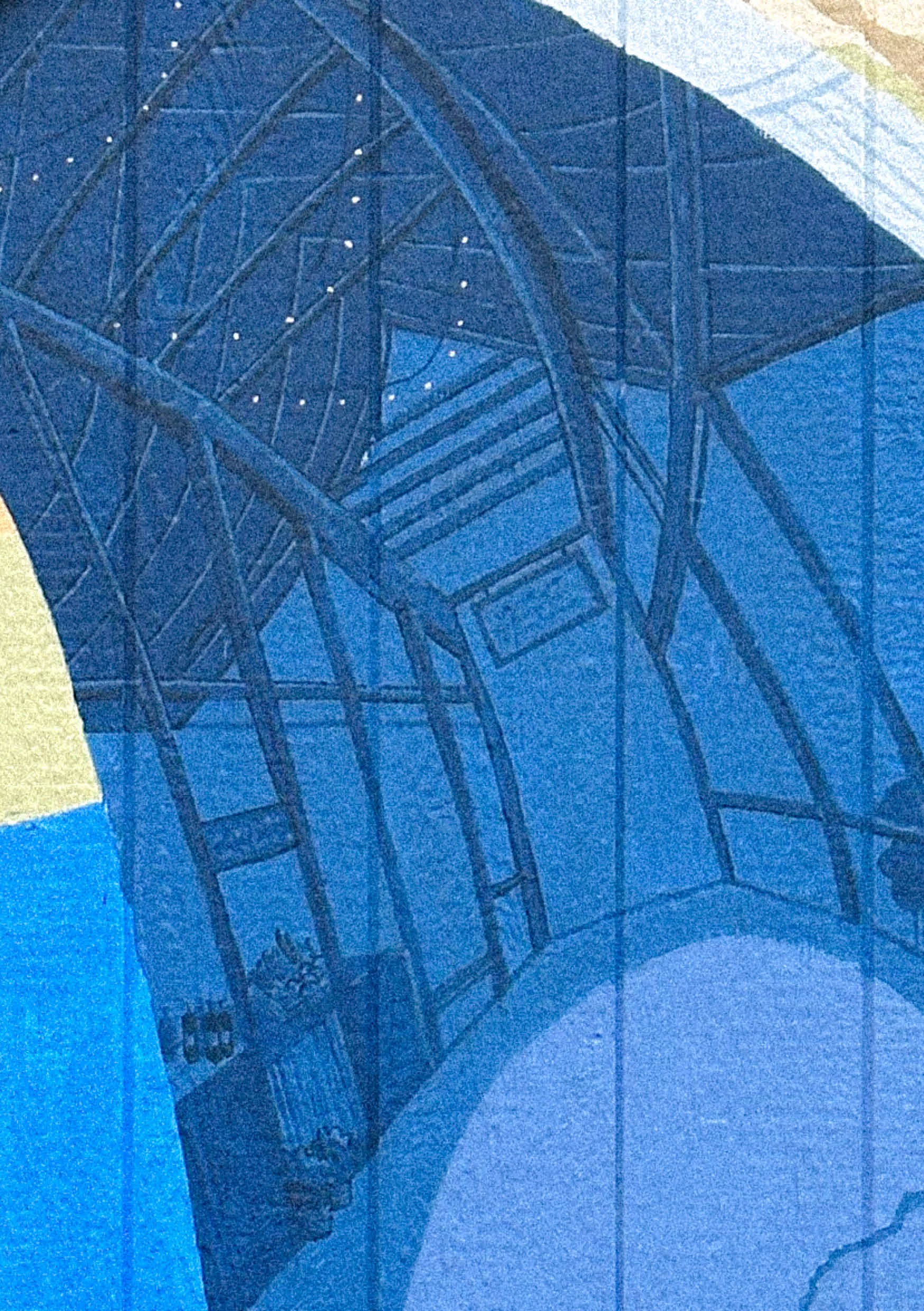
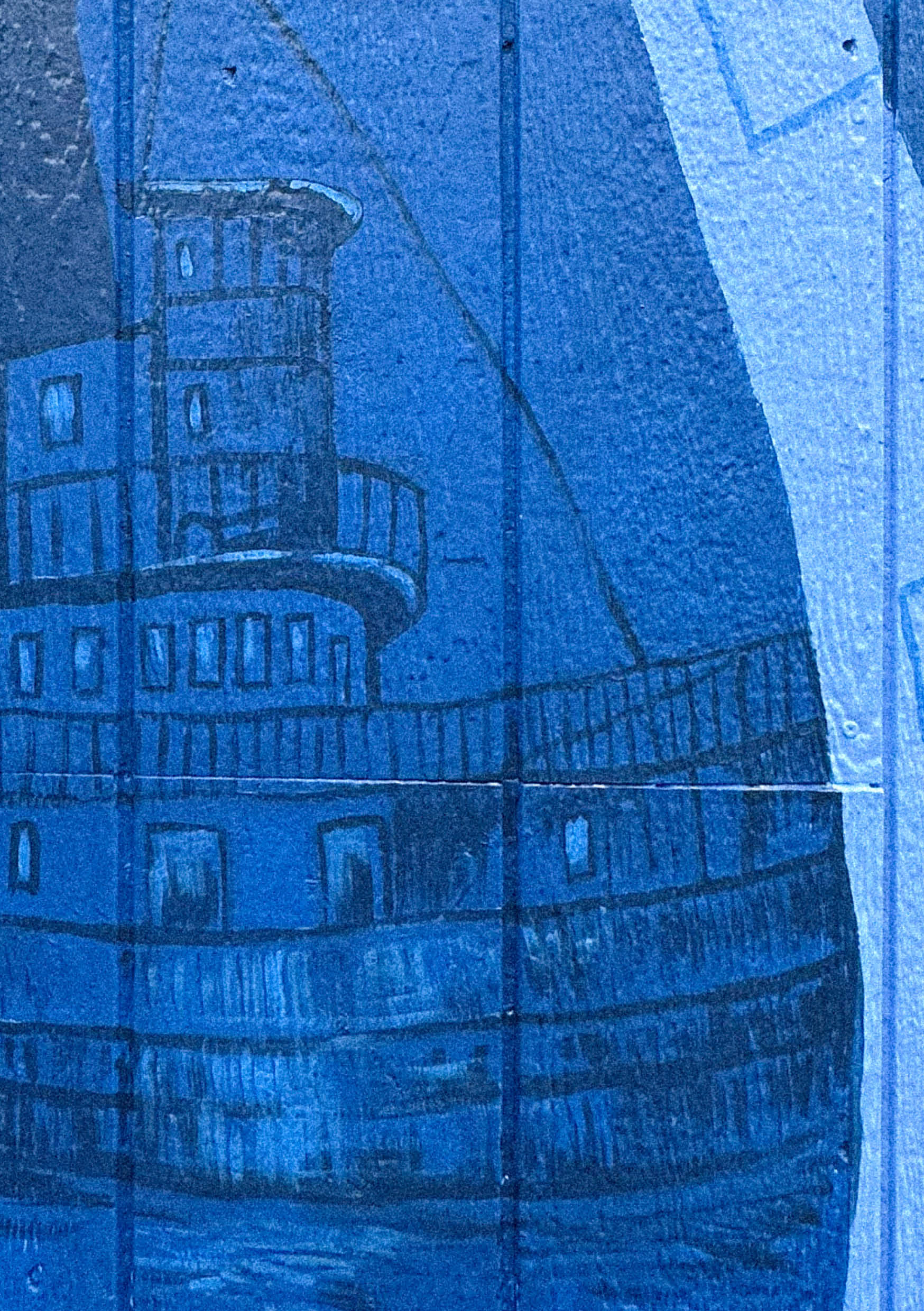
This mural shows a journey through space, time and history, a sailing odyssey through famed landmarks of Ithaca, NY. At first glance, we see a panorama of moments of celebration, but on deeper reflection, personal stories of the community unfold within each element of the painted adventure. Designed for an unconventional canvas, the mural moves onwards and upwards, inviting the viewer to embark on their own journey.
This project could not have happened without Tom Burke, who volunteered his wall and his heartwarming stories about Ithaca and its region. Tom is an avid advocate for sailing and aims to show his passion through requesting a depiction of his sailboat, Fantasia. See if you can spot a surprise guest - an orange octopus, - that has wandered over from our previous Ithaca mural.
----------------------------------------------------
Our process began with an open brainstorming session discussing landmarks, concepts and iconography the client had in mind for the general direction of the mural. Tom, who is extremely involved and attached to the Ithaca community and landscape, had a list of ideas that we helped him sift through by priority and by message.
The next stage was to dive into archives to find photo references of Ithaca and its identity. These photos became a library of ideas for drawing and developing the design.
To create a few design options for Tom, we used a design charette (a short timed exercise) to produce composition ideas quickly and efficiently, each of us choosing a different direction to explore.
Coloring is the next stage, often a very subjective and complex process. Our strategy was to use art references we thought would fit with the context (the original burgundy color of the house, the trees and the sky), extract color palettes from them and then create color passes for the composition we had in mind. These color passes were discussed in detail with Tom and a final was chosen, going for a soft approach.
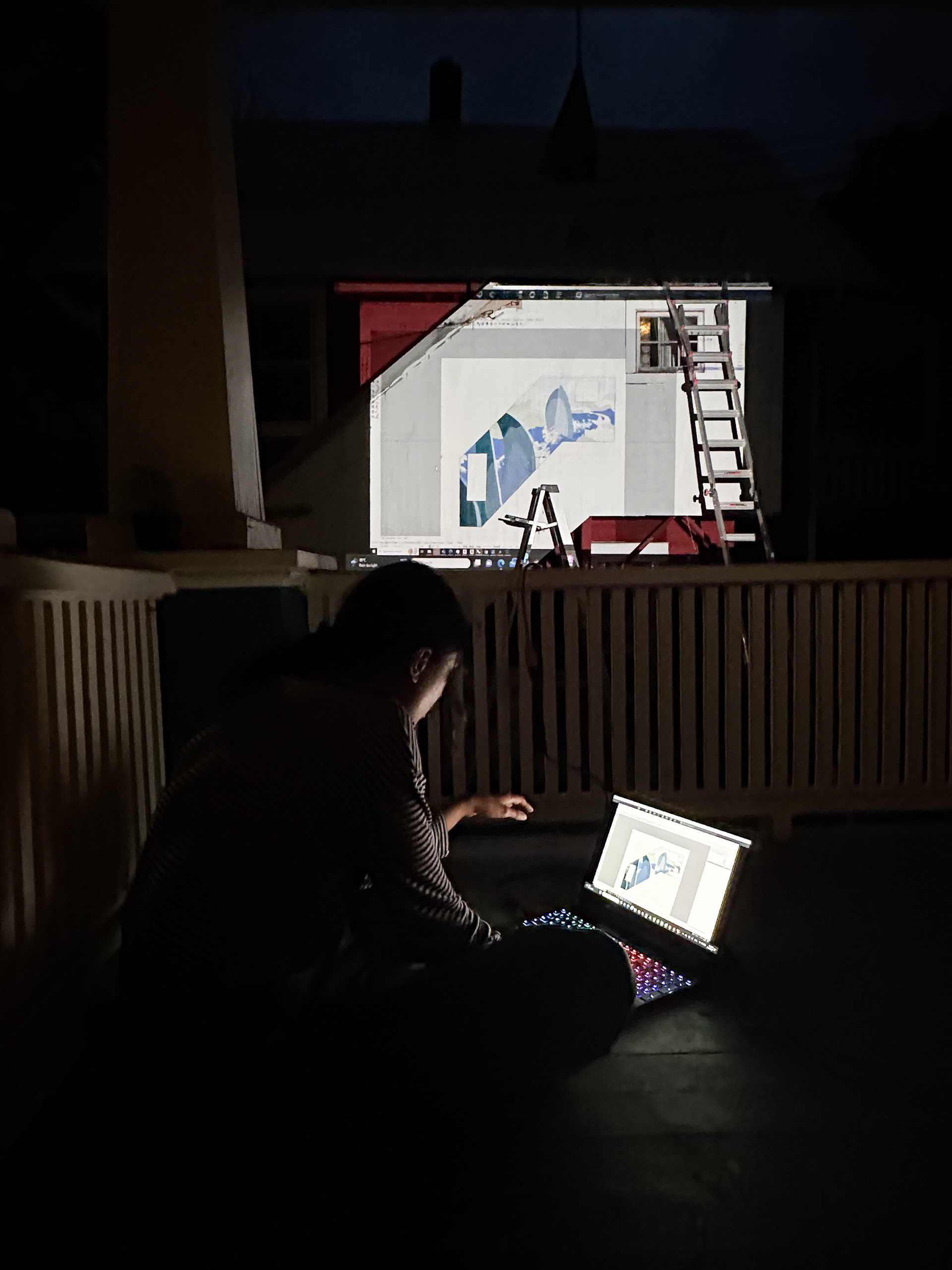
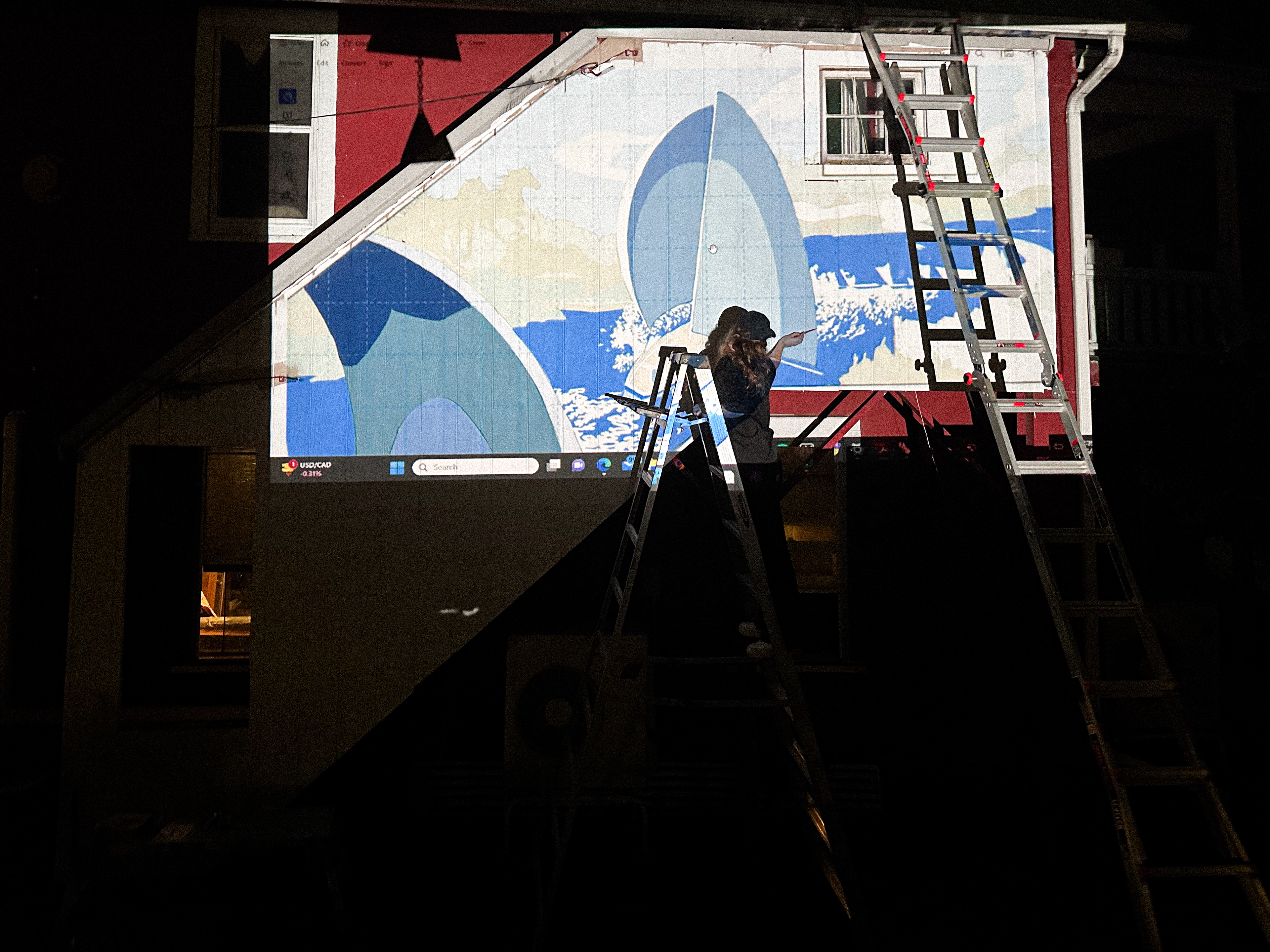
To transfer the mural on the wall we relied on three methods, a projector, plotted 1:1 sheets and grids. Since the wall is unconventionally shaped, a mixture of these strategies proved to be the best way forward. For the detail, we relied on our ability to freehand.
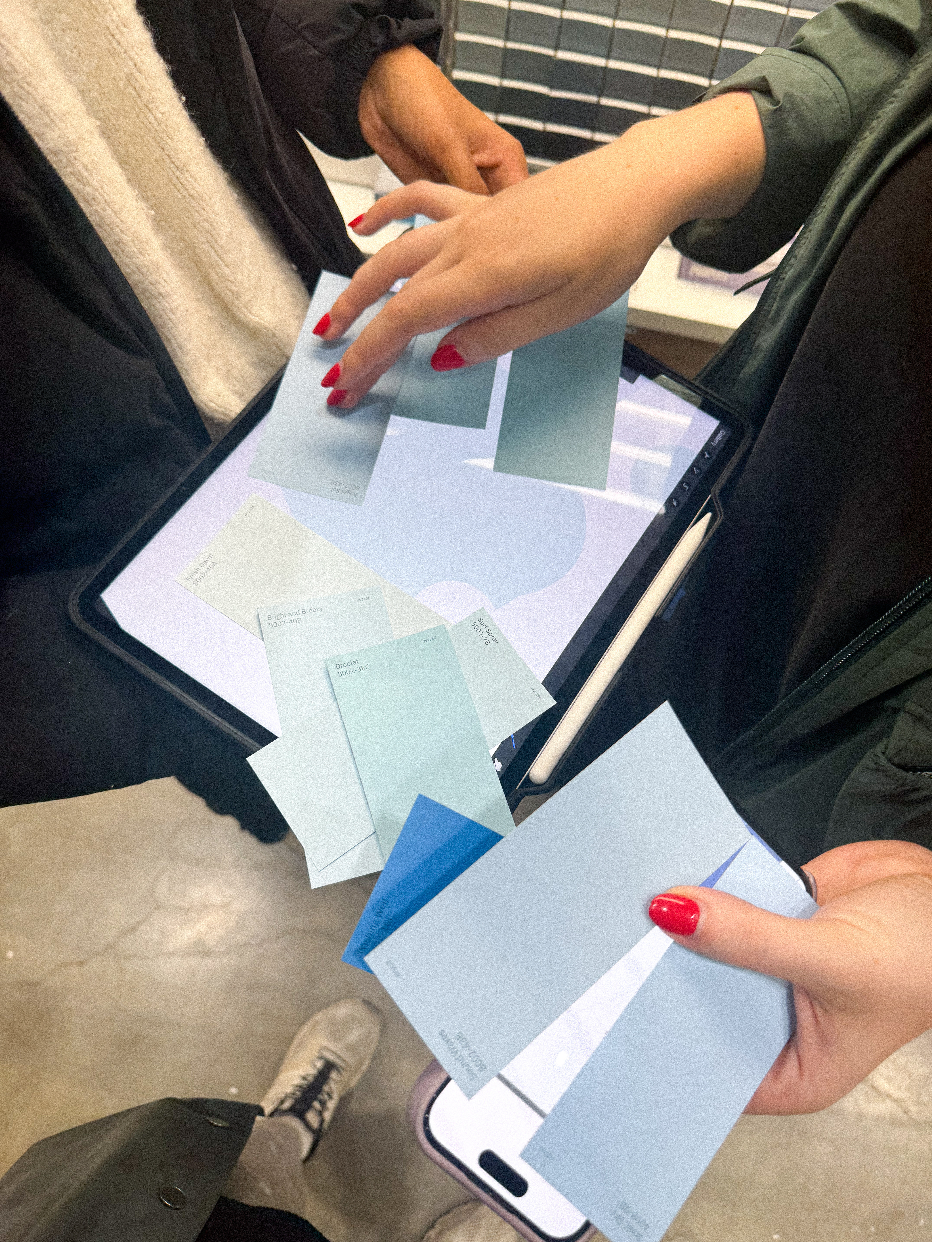
Color matching to paint is again, very difficult as different brands, finishes and even mixing machines produce varying results. With a swatch selection process, matching to pantone colors, we collected our paint colors in two sizes for the mural.
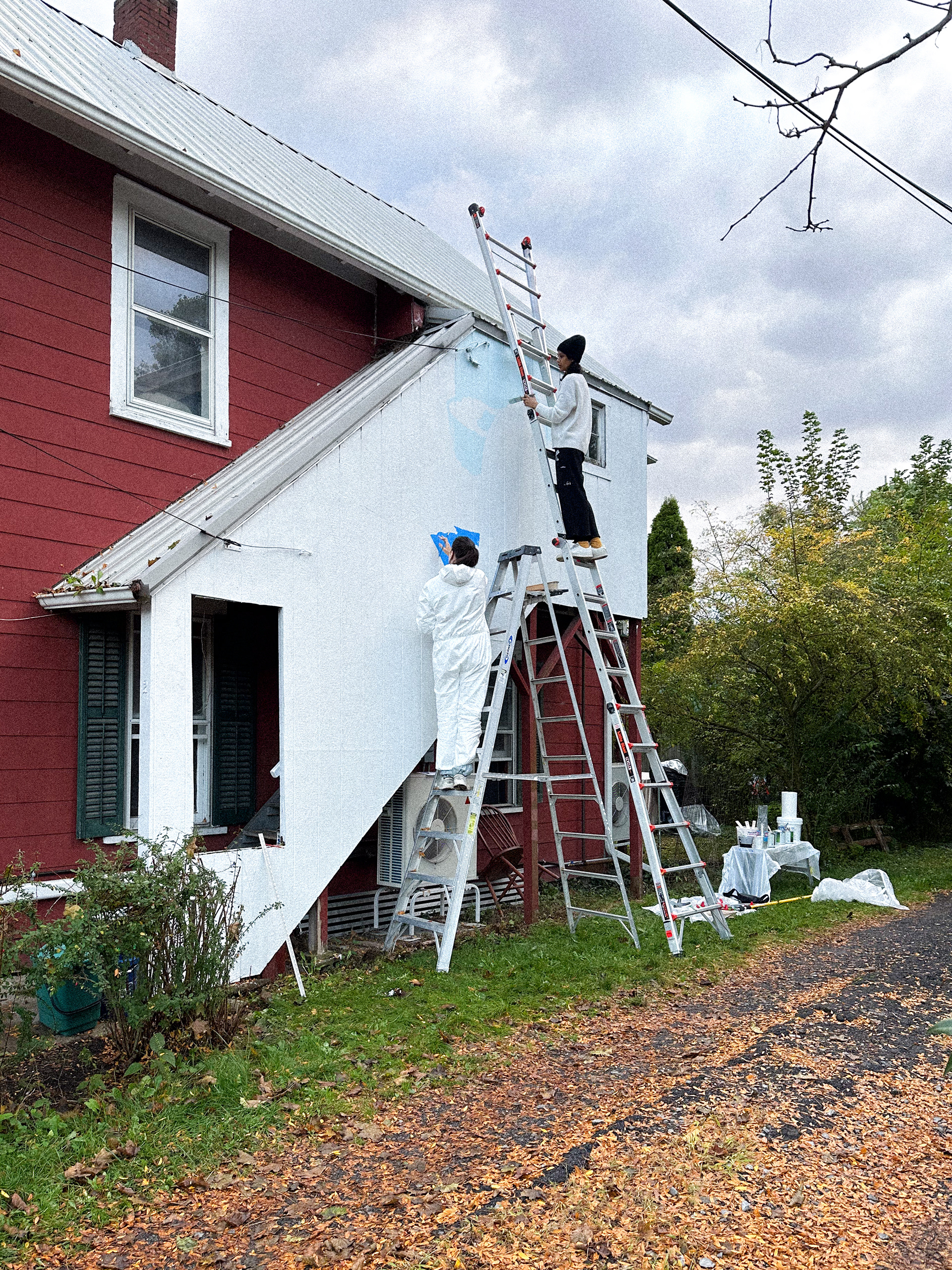
For painting, after sanding and priming the wall, we began by blocking out major colors. To paint efficiently, the strategy was to avoid mixing at all, making sure our paint selection covered all selected tints and shades. After blocking out major areas, we start layering details and the second wash of color to preserve longevity of the paint.
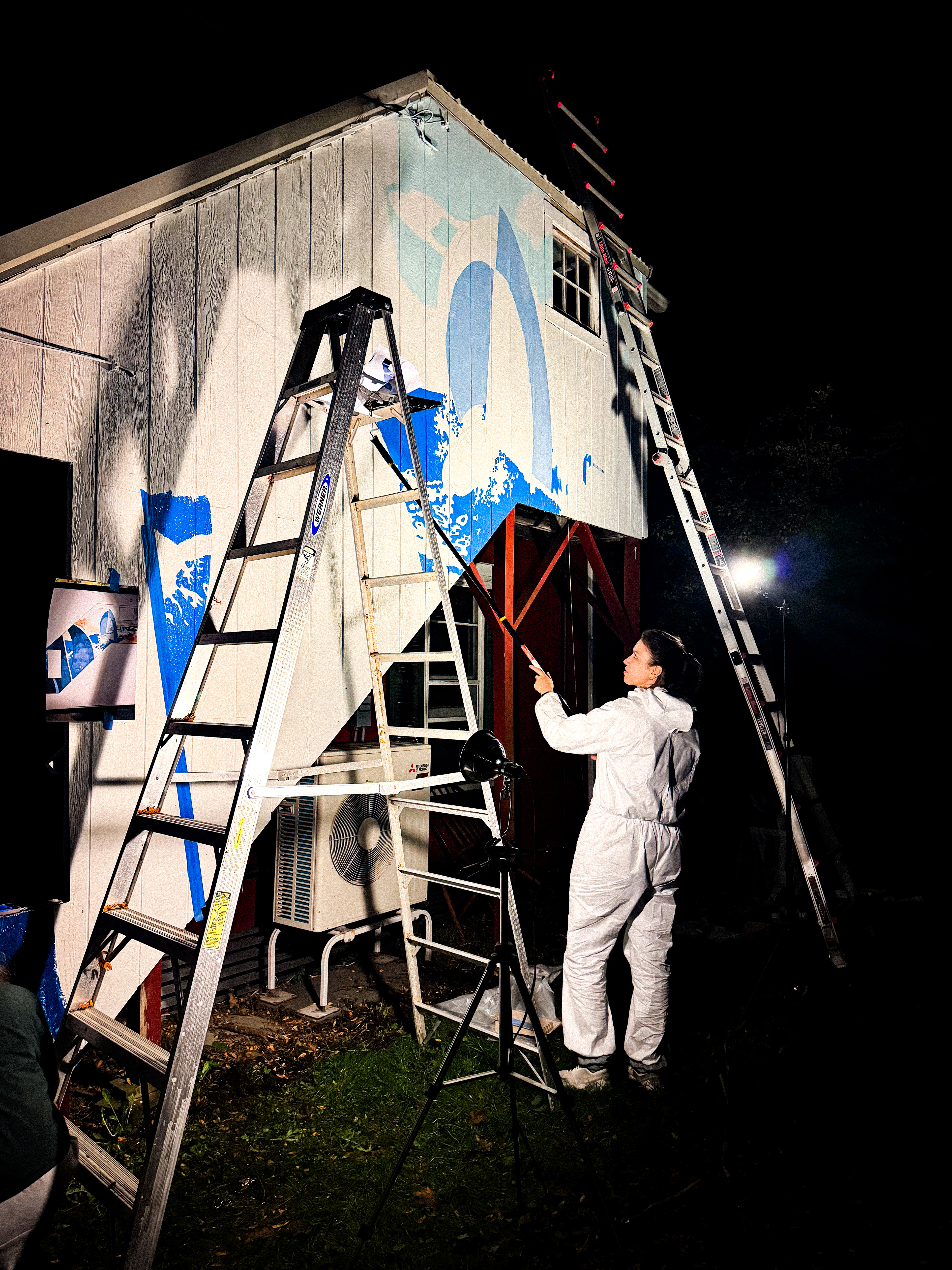
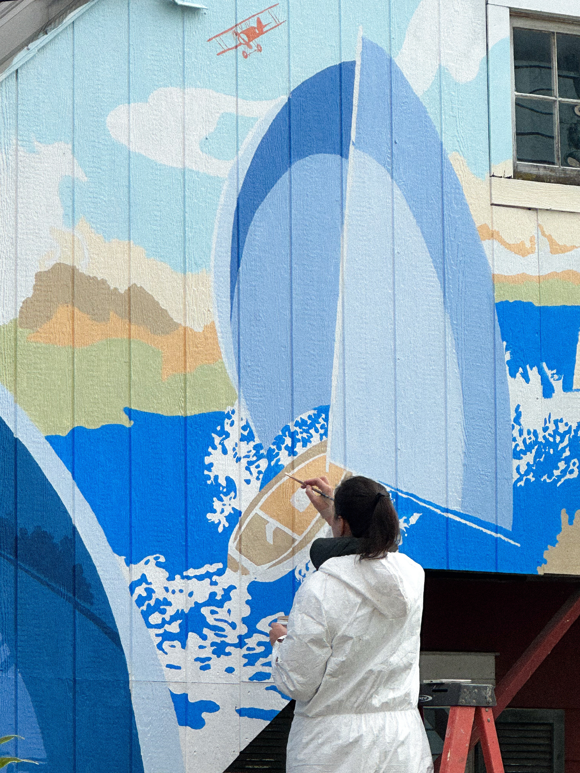
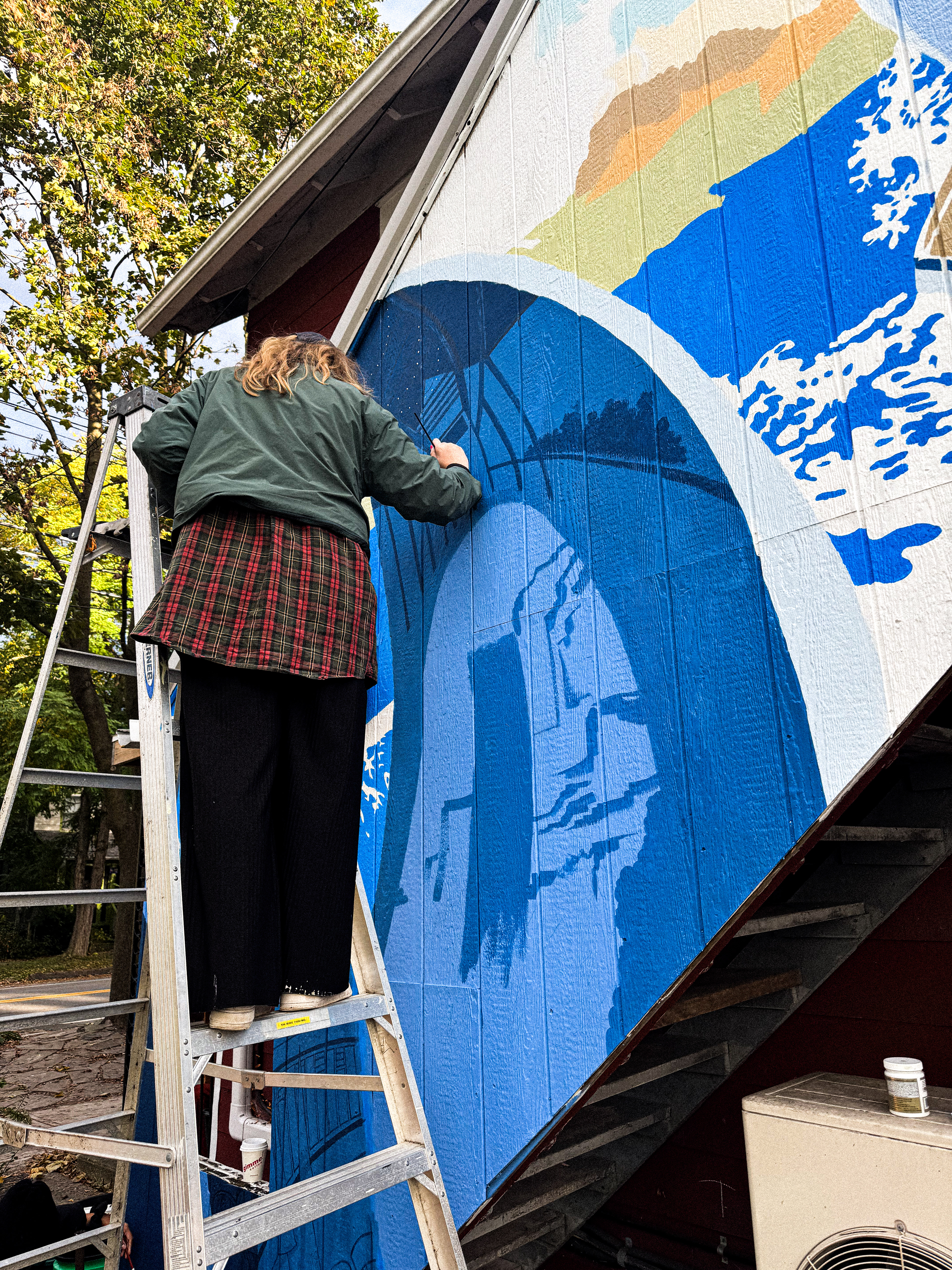
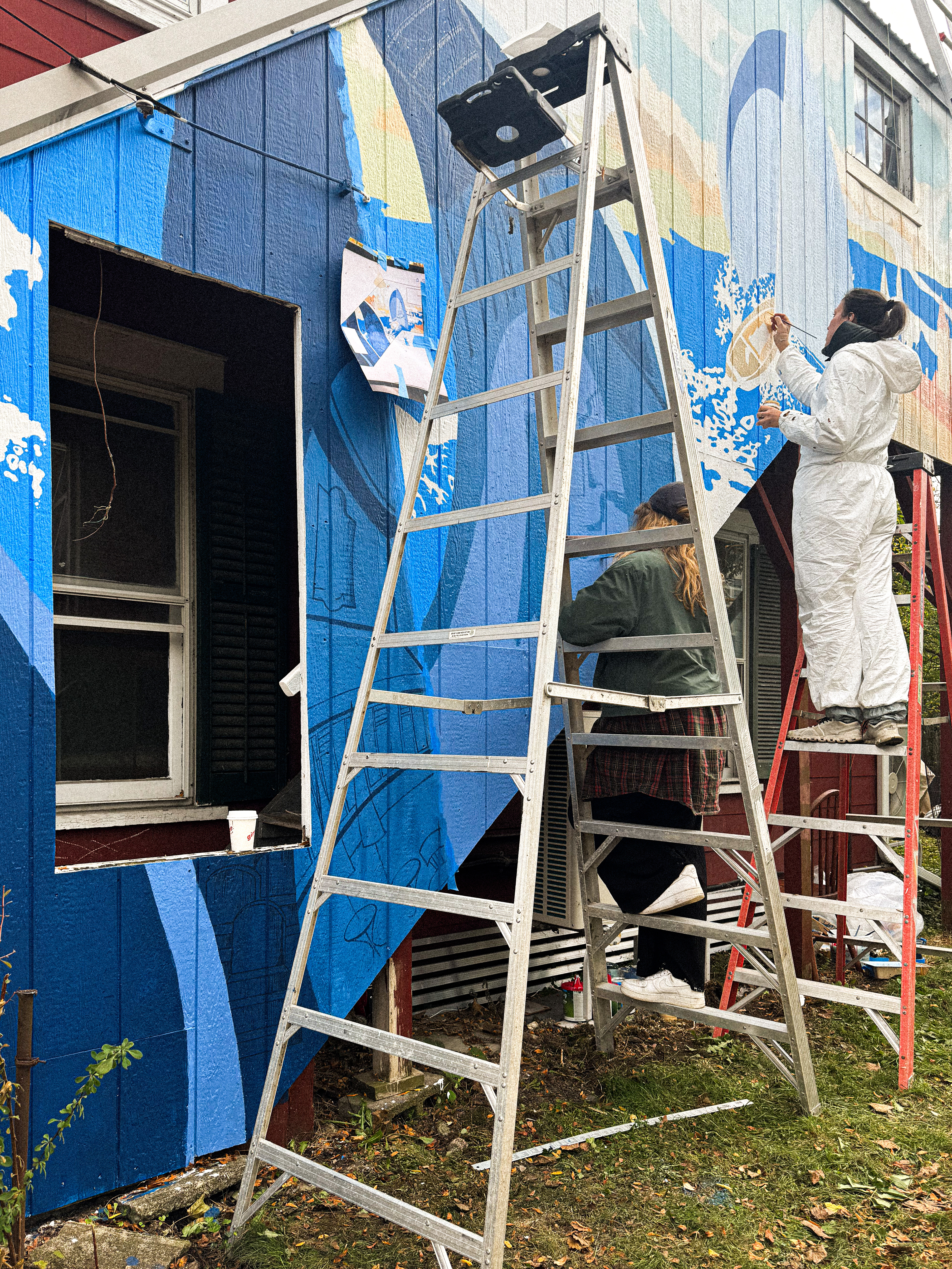
The rest of the of the details are then painted in carefully with smaller brushes.
